
Regional Placemaking in Sunny Southern Virginia
- Oct 28, 2021
- 3 min read
How do you create vibrant public space when supporting regional activation versus a dense urban core? This was the question presented to us as we joined up with the Microsoft Community Development team. The project ahead of us was located in Southern Virginia, a string of communities halfway between Raleigh and Richmond that boasted greenery, rolling hills, a large and popular lake, and now, a thriving Microsoft data center.

We traveled to Virginia and visited six of the towns and their mayors, council members, chambers of commerce, small business owners, and other municipal leadership. The region is dotted with small towns of varying sizes and each has their own unique draws: historic architecture, lakefront amenities, a bustling community college scene, lovely city and state parks, a brand-new county school building, botanical gardens, and even a legendary distillery. Physically, the space seemed peaceful and perfect, idyllic even. But looking past that, we learned that the leadership in each town was struggling with a regional identity crisis: how can they work as a unit to attract talent and build community across a rural region?
From our discussions, we knew we needed a tool that could travel and move quickly from town to town while supporting events of every shape and size as the community is brought together. We also knew that we needed to support children, families, and create cozy space with color, sound, and light. We also needed elements that could create interest and be flexible to support multiple uses.

With that in mind, we kicked off the planning and design for a pop-up demonstration event with one of our Better Blocks in a Box. Our goal was to build an engaging event, create beautiful space, and prompt regional leadership to imagine their own community events, ultimately booking the container for their own space.
We selected the site in downtown Clarksville, a small, centrally located, lake front town with a pre-existing grassy lawn and shaded music pavilion. Already in use on summer weekends for concerts, this area typically sat vacant and unused during the week. We reimagined the space with string lights, wheat paste murals on an adjacent building, and a removable mural on the concrete pad serving as a dance floor. Variety is the spice of life and good public space, so we added a range of seating from beer hall tables to bistro sets to lawn chairs to air hammocks. For whimsy, we added dozens of kids' games and umbrellas. The shipping container we began designing had fold-out bar counters with windows that could be used as a ticket booth, wine tasting bar, or concession stand. It was able to be powered with either a generator or the solar panels on top of the container, depending on the setup. It also had organizational boxes to store items, as well as a full 20-foot kerf wall with flexible shelves, hooks, and cubbies.
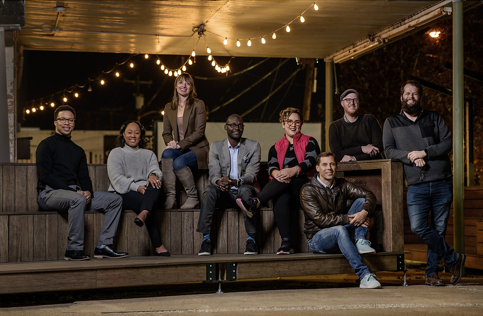
For the project to be successful, we needed town leadership to envision the container in dozens of settings, so we mocked up a two-night event. The first, a dance party with local wineries and distilleries, and the second, a family-friendly outdoor movie night. We called upon our Block Captains: Kelly Lanier-Arnold, Microsoft; Jeff Jones, City of Clarksville; and Sheila, Kerr Lake Chamber of Commerce. These partners helped guide us through permits, issues with DOT, and outreach to local small businesses. With their help, we had amazing local touches on every aspect of the project with beverage options of local wine, beer, and spirits as well as popular DJs, artists, and hardworking volunteers living locally.


The feedback was positive, and Microsoft had three reservations for the container before the weekend was over! As always, we want to equip and empower the local community to continue placemaking work long after we’re gone, so we were delighted when we were able to donate the container and all its equipment over to the local high school. With their construction and civics students, they are now able to run the logistics, repair, and setup of the container from a vocational training perspective, teaching the students lessons in fabrication and construction, civic engagement, urban design, and events management. Their ability to iterate on the initial design to add elements to the container is a dream come true for us at the Better Block, and another example in which our work is just the beginning of a series of community projects leading toward greater public places, quality of life, and engaged community builders.


net88 dạo này thấy nhiều người nhắc nên mình cũng tò mò vào thử xem giao diện thế nào. Mình không có soi kỹ từng trò hay gì, chủ yếu lướt qua cách họ sắp xếp nội dung thôi. Ấn tượng đầu là bố cục khá thoáng, nhìn một cái là biết chỗ nào để bấm, không bị nhồi chữ quá nhiều. Mình dùng trên điện thoại mà vẫn thấy mượt, các mục chuyển qua lại nhanh, không kiểu phải zoom tới zoom lui mới đọc được. Phần hiển thị thông tin cũng gọn gàng, dạng khối rõ ràng nên lướt vài phút là nắm được trang đang nói gì. Nói chung cảm giác họ làm giao diện ưu tiên…
BALL88 mình cũng mới ghé thử vì thấy bạn bè nhắc hoài, kiểu vào xem cho biết chứ không định chơi gì. Vừa mở lên là thấy giao diện khá sạch và hiện đại, nhìn không bị rối như nhiều site khác. Mình lướt một vòng thì thấy họ gom nhiều thứ vào chung một chỗ, không chỉ mỗi cá cược thể thao mà còn có mảng game đổi thưởng nữa, nên cảm giác “hệ sinh thái” khá rõ. Cái mình thích là cách họ chia nội dung theo từng khối, kéo xuống vẫn dễ theo dõi, không bị lạc. Mấy phần thông tin trình bày gọn, nhìn lướt là hiểu đang ở mục nào. Nói chung trải nghiệm xem…
hitclub dạo này thấy nhiều người nhắc nên mình cũng ghé thử cho biết, kiểu vào xem giao diện có dễ dùng không thôi. Mình không đọc kỹ nội dung, chỉ lướt qua vài đoạn giới thiệu và mấy mục chính. Cảm giác đầu tiên là trang làm khá “thoáng”, chữ không dồn dập, chia khối rõ nên nhìn một cái là biết đang ở phần nào. Mình mở bằng điện thoại thì thấy ổn phết, trang tự căn lại vừa màn hình, bấm qua lại không bị nhảy lung tung hay phải phóng to thu nhỏ liên tục. Nói chung nhìn thân thiện, không màu mè quá, và cái cách họ sắp xếp menu với các khối nội dung…
cakhia tv mình thấy bạn bè nhắc hoài nên tối qua cũng ghé thử cho biết, kiểu vào xem có dễ dùng không thôi chứ không phải fan cứng gì. Vừa mở lên thấy trang load khá nhanh, bấm qua lại mấy mục vẫn mượt, không bị đứng hình khó chịu. Mình để ý nhất là phần thông tin cập nhật khá lẹ, nhìn lịch thi đấu với kết quả là thấy ngay, không phải mò nhiều. Giao diện cũng đơn giản, chữ rõ nên lần đầu vào vẫn biết phải nhìn chỗ nào. Nói chung mình thích kiểu gọn gàng vậy, nhất là mấy khung lịch thi đấu và kết quả được cập nhật real-time ngay trên trang.
ALO8 kjc mình thấy mấy hôm nay bạn bè nhắc hoài nên tiện tay vào thử cho biết. Không phải kiểu vào để “soi kèo” hay gì, chủ yếu xem trang chạy có ổn không với bố cục có dễ nhìn không thôi. Vừa mở lên cái là thấy load khá nhanh, bấm qua lại vài mục mà không bị khựng, chắc họ dùng máy chủ kiểu chia tải nên giờ cao điểm vẫn mượt. Giao diện thì nhìn gọn gàng, chữ không bị dồn, mấy khối thông tin tách ra rõ nên lướt một vòng là nắm được mình đang ở đâu. Mình thích nhất là phần menu đặt dễ thấy, kéo xuống vẫn không bị lạc, với các…